Introduction
A wordmark is much more than just a brand name in text; it’s a strategic logo style that uses typography as the primary tool to convey identity, personality, and recognition. For business owners, understanding what a wordmark entails and how to design one effectively can transform how customers perceive your brand. This style focuses exclusively on the textual element, making font choice, color application, and clarity vital to success. Each chapter will dive deeper into these aspects—from the fundamental concepts of wordmarks and their typographic foundations, to the role of color theory, readability considerations, and how these design choices express your brand’s essence. Finally, practical examples will demonstrate how wordmarks come to life in the marketplace, helping you envision and craft a distinctive logo that speaks directly to your audience.
Tables of Contents
Chapter 1: Defining Wordmark: Core Concepts and Characteristics
- Crafting Recognition: The Impact of Typography and Design in Wordmarks
- Color and Visual Identity: Crafting the Emotional Impact of Wordmarks
- How Wordmarks Enhance Brand Recognition and Align with Market Needs
- The Essential Role of Consistency and Scalability in Wordmark Design
- Preserving Brand Identity through Wordmark Usage Guidelines and Integrity
Chapter 2: Typography in Defining Wordmark: Fonts and Letterforms
- Crafting Brand Identity Through Strategic Font Selection and Letterform Design
- How Letterform Design Shapes Legibility and Brand Identity in Wordmarks
- How Technological Innovation Shapes Typography and Letterforms in Wordmark Design
- The Economic and Cultural Power of Typography in Wordmarks
- Cultural and Political Dimensions Shaping Wordmark Typography
Chapter 3: Color Theory and Its Role in Defining Wordmark Identity
- How Color Psychology Shapes Emotional Connections in Wordmark Design
- How Strategic Color Choices Shape Emotional Connection and Brand Perception in Wordmarks
- Harmonizing Typography and Color: Crafting a Distinctive Wordmark Presence
- Mastering Color Choice and Cultural Sensitivity to Enhance Wordmark Impact Across Mediums
- Harnessing Color’s Emotional Power to Strengthen Wordmark Recognition and Brand Connection
Chapter 4: Readability and Legibility in Defining Wordmark Designs
- How Thoughtful Typography Shapes Clear and Memorable Wordmarks
- How Technology Elevates Readability and Legibility in Wordmark Design
- Balancing Cost and Clarity: Economic Impacts on Wordmark Readability and Legibility
- Navigating Cultural and Geopolitical Nuances to Enhance Wordmark Readability
- How Readability Shapes Brand Perception and Consumer Behavior in Wordmarks
Chapter 5: Brand Personality and Messaging through Defining Wordmark
- Typography as the Visual Voice in Defining Wordmark Brand Identity
- Crafting Brand Voice and Emotional Tone to Elevate Wordmark Identity
- Harnessing Color’s Emotional Power to Enrich Wordmark Brand Identity
- Balancing Adaptability and Recognition: Maintaining Wordmark Consistency Across Platforms
- Crafting Cohesive Brand Identity by Merging Wordmark Design with Verbal Messaging
Chapter 6: Practical Applications and Examples When Defining Wordmark
- Strategic Typography and Color Choices: Crafting Effective Wordmarks in Practice
- Leveraging Wordmarks for Cohesive Digital Branding and Media Presence
- Mastering Brand Guidelines to Ensure Wordmark Consistency and Recognition
- Seamless Brand Unity: Integrating Wordmarks into Packaging and Merchandise
- Enhancing Brand Identity: Integrating Wordmarks with Visual Elements for Versatile Logos
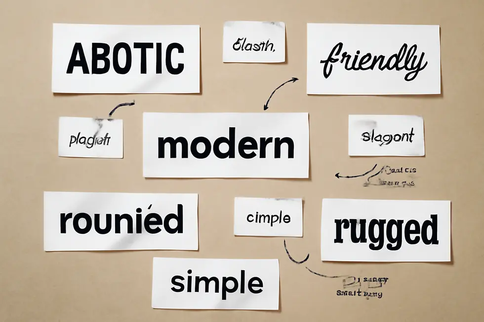
Chapter 1: Defining Wordmark: Core Concepts and Characteristics
![]()
1. Crafting Recognition: The Impact of Typography and Design in Wordmarks
A wordmark’s strength lies in its typographic precision and design harmony, where each letter becomes a vital visual component. Choosing the right font—be it serif for tradition or sans-serif for modernity—sets the brand’s tone without relying on symbols. Designers often refine letter spacing and customize characters to enhance uniqueness while maintaining clarity, ensuring the name remains legible at any scale. Negative space balances the composition, fostering both simplicity and aesthetic appeal. Color complements typography by reinforcing brand identity, yet the typographic choices alone must sustain recognition across diverse media. This careful orchestration transforms a simple text into a memorable, versatile brand signature. For more insight into typography’s role in brand design, see the video “What Is Wordmark Logo Design?” and explore this company trademarks and logos resource.
2. Color and Visual Identity: Crafting the Emotional Impact of Wordmarks
The color palette and visual identity of a wordmark are pivotal in shaping how a brand’s name is perceived. Since a wordmark consists solely of stylized text, colors become the emotional language that communicates personality and tone. Primary colors establish this core feeling, while secondary and neutral shades support clarity and hierarchy. Precise color specifications ensure consistent reproduction across all platforms, reinforcing brand recognition at every touchpoint. Beyond color, visual identity encompasses typography and imagery working in unison, creating a cohesive presence that is instantly recognizable. Accessibility is key; contrast and legibility must be balanced to maintain clarity at various sizes and backgrounds. Together, these elements transform simple text into a memorable symbol that resonates deeply with audiences. For detailed guidelines on brand protection and identity, consider exploring trademark protections for business names and logos.
3. How Wordmarks Enhance Brand Recognition and Align with Market Needs
Wordmarks excel at making a brand’s name the primary visual element, which strengthens recognition especially for concise or unique names. Their effectiveness lies in using carefully chosen typography and color to express a brand’s personality, making the logo memorable without relying on symbols. This approach suits diverse markets and industries, adapting easily to both local and global scales due to its straightforward design. The balance between readability and distinctive typographic style allows wordmarks to communicate brand identity clearly across multiple platforms and contexts. Thoughtful testing under real-world conditions ensures these logos maintain impact and legibility at any size or medium. Their simplicity and strategic design foster lasting brand recall, making wordmarks ideal for businesses seeking strong name-based identity. For deeper insights on trademark protection related to brand names and logos, visit trademark protection for business name & logo. For additional details, see the explanation at GraphicDesignEye.
4. The Essential Role of Consistency and Scalability in Wordmark Design
Consistency and scalability are vital in defining an effective wordmark. Consistency ensures that the wordmark’s typography, color, and spacing remain uniform across all platforms, preserving brand recognition and professionalism. Strict adherence to specific fonts, color codes, and clear space rules prevents distortion and maintains its intended visual impact. Scalability allows the wordmark to retain clarity and legibility from the smallest digital icons to large print displays, offering versatility across diverse applications. Well-crafted size guidelines and simplified versions support adaptability without compromising identity. Together, these principles reinforce brand trust and facilitate seamless communication. For a comprehensive framework on maintaining wordmark consistency and scalability, see Moldstud’s article on visual brand guidelines.
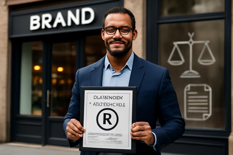
5. Preserving Brand Identity through Wordmark Usage Guidelines and Integrity
Wordmark logos depend on carefully crafted typography and color to visually express a brand’s unique identity. Maintaining brand integrity requires strict adherence to usage guidelines that ensure the wordmark remains legible and consistent across all applications. These guidelines cover essential elements such as size, clear space, and color usage to prevent distortion or misrepresentation. For example, minimum size requirements maintain readability even in small formats like embroidery or app icons, while a defined clear space protects the wordmark from visual clutter. Alterations such as stretching, recoloring beyond the approved palette, or applying effects are prohibited as they weaken brand recognition. Providing detailed examples of correct and incorrect applications helps safeguard the wordmark’s visual impact. Such discipline reinforces consumer trust and brand recall, keeping the wordmark both memorable and reliable. For a structured approach to these standards, see the comprehensive brand guidelines provided by Reach Influencers.
Chapter 2: Typography in Defining Wordmark: Fonts and Letterforms
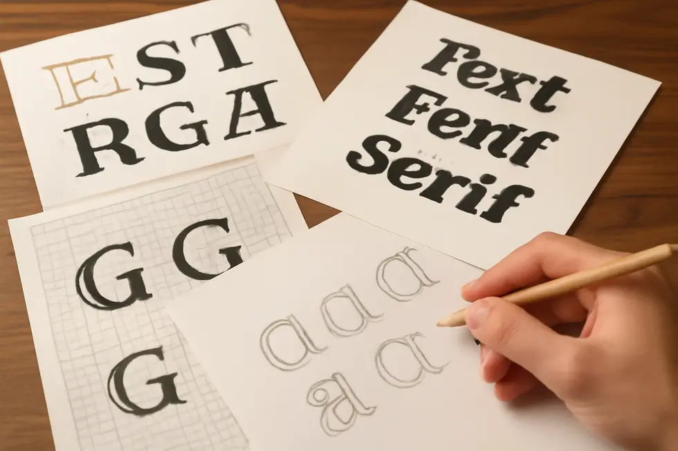
1. Crafting Brand Identity Through Strategic Font Selection and Letterform Design
Choosing the right font is pivotal in creating a wordmark that conveys a brand’s core personality and values. The typeface sets the emotional tone—whether modern, traditional, elegant, or creative—by its style, such as sans serif for simplicity, serif for heritage, or script for flair. Beyond typeface choice, subtle customizations to letterforms, including spacing adjustments and unique ligatures, help the wordmark achieve distinctiveness without sacrificing clarity. Readability remains essential; fonts with balanced stroke weights and clean lines ensure legibility across sizes and media, preventing loss of impact in smaller applications. This deliberate balance between expression and function ensures the wordmark stands out as a bespoke symbol of the brand’s identity. For further insight on creating custom wordmarks, see this detailed guide from GoDaddy.
2. How Letterform Design Shapes Legibility and Brand Identity in Wordmarks
Letterform design is the cornerstone of effective wordmark typography, balancing legibility with brand expression. Every curve, stroke weight, and spacing decision influences readability across sizes and media, ensuring the brand name remains recognizable whether on a billboard or a smartphone screen. Custom letterforms tailor proportions and kerning to establish a unique rhythm and cohesiveness that set a brand apart. The choice between serif or sans-serif, thick or thin strokes, and stylistic details conveys subtle brand personality traits—from authority to elegance. Historical influences enrich these designs, blending classical aesthetics with modern clarity. This thoughtful typography creates a scalable, versatile wordmark that communicates identity purely through text, enhancing brand recognition. For more on protecting your distinctive wordmark, consider exploring trademark protection for business names and logos.
3. How Technological Innovation Shapes Typography and Letterforms in Wordmark Design
Technological innovation has revolutionized how typography defines wordmarks, enabling unprecedented precision and adaptability. Variable fonts now allow letterforms to dynamically adjust for optical sizing, ensuring clarity across digital and print at all scales. Grid-based design systems inspired by automation and robotics give letterforms a modern, geometric balance while retaining visual harmony. Custom typography tools empower designers to refine spacing and character shapes with ease, personalizing wordmarks without advanced skills. Advances in kinetic typography support animated wordmarks that enhance engagement. Meanwhile, retro digital styles like glitch and pixel art add nostalgic texture to typographic identities. Additionally, technology enhances accessibility by crafting distinct letterforms that reduce character confusion, crucial for inclusive design. These innovations collectively expand how wordmarks visually communicate brand personality, readability, and presence. For more on font trends and their impact, see the Most Popular Typefaces 2025 Update.
4. The Economic and Cultural Power of Typography in Wordmarks
Typography within wordmarks wields profound economic and societal influence by shaping brand identity and consumer perception. Strategically crafted fonts and letterforms enable brands to stand out, directly contributing to financial success by fostering recognition and trust. For instance, typographic consistency in city branding can enhance economic opportunities such as tourism and investment, demonstrating how visual language translates to real-world value. Beyond economics, typography conveys cultural narratives and emotional cues—bold geometric fonts suggest strength and clarity, while heritage styles evoke authenticity and tradition. This dual role ensures wordmarks resonate widely across media, maintaining their impact as cultural symbols and economic assets. Rigorous typographic standards within brand systems safeguard this value, balancing legibility and personality to sustain brand equity. For more on protecting a company’s identity, see trademark protection for business names and logos.
5. Cultural and Political Dimensions Shaping Wordmark Typography
Typography in wordmark design transcends aesthetics by embedding cultural identity and geopolitical narratives within fonts and letterforms. Globally, trends emphasize modern minimalism and human-centric typefaces that balance readability with cultural nuance, allowing brands to connect authentically across markets. Historically, typography has also conveyed power and heritage, as seen in corporate wordmarks adapting type styles that reflect national pride or dominance. Today’s wordmarks harness bold, adaptable fonts mirroring a brand’s agility amidst shifting global dynamics. This fusion of global design currents with geopolitical symbolism enables wordmarks to communicate complex values—authority, modernity, or tradition—through careful typographic choices. For deeper insight into trademark protection of such distinctive logos, explore this comprehensive guide.
Chapter 3: Color Theory and Its Role in Defining Wordmark Identity
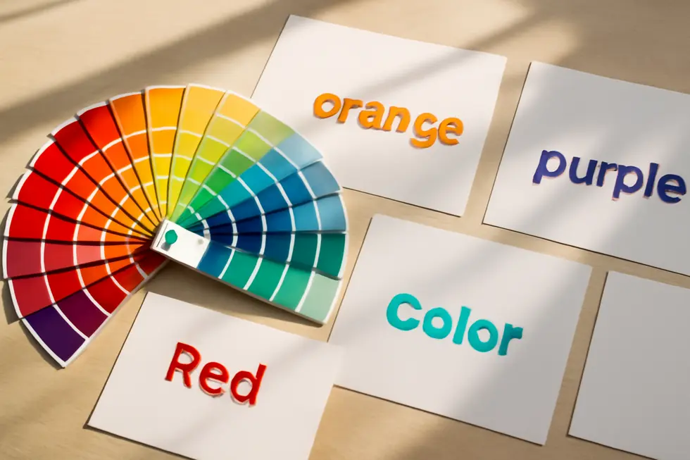
1. How Color Psychology Shapes Emotional Connections in Wordmark Design
Colors in wordmark design are far more than aesthetic choices; they serve as powerful psychological cues that evoke specific emotions and shape consumer perceptions. For example, red ignites energy and urgency, capturing immediate attention, while blue inspires trust and calm, qualities ideal for professional sectors. Green reflects growth and sustainability, aligning well with eco-conscious brands. These emotional signals help establish a brand’s personality even before consumers engage with it. Consistent color usage enhances brand recognition dramatically, with studies noting that color accounts for up to 80% of immediate brand recall. When combined with typography, color further refines the message—cool hues paired with clean fonts suggest reliability, whereas warm tones and classic letterforms communicate passion or tradition. This subconscious influence of color drives consumer trust, loyalty, and responsiveness, making it a critical tool in crafting a memorable wordmark identity. For deeper insights, the article on the psychology of color in marketing and branding offers valuable perspectives.
2. How Strategic Color Choices Shape Emotional Connection and Brand Perception in Wordmarks
Color choices deeply affect how a wordmark is perceived by evoking specific emotional responses tied to brand identity. Through color theory, each hue communicates unique psychological messages: red evokes urgency and passion, blue suggests reliability, green reflects growth, yellow radiates optimism, and purple conveys creativity or luxury. These responses influence consumers’ initial impressions, often before any brand interaction. Consistent use of a signature color palette across wordmarks strengthens recognition, with color alone responsible for up to 80% of brand recall. For wordmark designs, color accentuates typography, amplifying personality and fostering trust. A well-chosen palette unifies brand messaging, helping the wordmark stand out while communicating core values. For more on color psychology’s impact on branding, see Spiel Creative’s detailed discussion.
3. Harmonizing Typography and Color: Crafting a Distinctive Wordmark Presence
Typography and color theory work in tandem to shape a wordmark’s identity by conveying personality and evoking emotion. Letterforms—from stately serifs to sleek sans-serifs—express distinct brand traits, while color choices signal mood and meaning. Effective wordmarks balance legibility and style through thoughtful font selection, letter case, and consistent stroke weight. Meanwhile, colors rooted in theory—whether contrasting or harmonious—boost readability and deepen emotional resonance. Together, these elements forge a visual synergy that enhances brand recognition and memorability. Designers must carefully test their combined impact across sizes and contexts to ensure clarity and emotional appeal endure, embodying the brand visually through both typographic voice and thoughtful color use. For deeper insight, explore the Wordmark Logo Masterclass.
4. Mastering Color Choice and Cultural Sensitivity to Enhance Wordmark Impact Across Mediums
Defining a wordmark’s identity through color is a nuanced process that merges psychological insight with cultural awareness and design precision. Colors evoke specific emotions—red ignites passion, blue instills trust, and green symbolizes growth—making their selection vital for aligning with brand personality. However, meanings shift across cultures; a color conveying optimism in one region may carry negative connotations elsewhere. Thus, research into cultural symbolism prevents misinterpretation, ensuring universal appeal. Beyond cultural factors, rigorous testing across digital, print, and monochrome platforms confirms legibility and vibrancy, preserving brand consistency. Typography works hand-in-hand with color to craft visual balance and reinforce messaging. This iterative collaboration between designers and stakeholders refines the wordmark, culminating in a distinct, adaptable emblem that resonates globally. For deeper insights into logo creation and protection, exploring trademark2go’s resources on trademark protection is recommended. Analyzing such strategic color integration reveals how logos maintain impact and memorability worldwide.
5. Harnessing Color’s Emotional Power to Strengthen Wordmark Recognition and Brand Connection
Color theory is essential in shaping a wordmark’s identity by selecting hues that mirror brand personality and evoke targeted emotions. Each color carries unique psychological associations—red energizes, blue instills trust, green soothes, and black conveys sophistication. When these colors integrate with typography, they form a powerful visual language that enhances memorability and emotional resonance. Strategic color choices must also ensure high contrast for legibility across sizes and mediums, maintaining clarity wherever the wordmark appears. Limiting the palette to two or three colors avoids visual clutter while reinforcing brand cohesion. This thoughtful balance between emotional impact and functional design helps the wordmark leave a lasting impression and fosters deeper audience connection. For insights into maintaining brand integrity through design, see trademark name protection strategies. Color theory and branding fundamentals also provide valuable complementary knowledge.
Chapter 4: Readability and Legibility in Defining Wordmark Designs
1. How Thoughtful Typography Shapes Clear and Memorable Wordmarks
Typography serves as the cornerstone of readability and legibility in wordmark design, transforming mere text into a powerful brand symbol. Selecting a typeface that embodies the brand’s personality—whether modern sans-serif for simplicity or classic serif for tradition—sets the emotional tone. Equally crucial is the customization of letter spacing and character styling to maintain clarity at different scales and across media. Overly ornate fonts can obscure letterforms, so simplicity and consistent stroke weight are vital for quick recognition and accessibility. By harmonizing these elements, a wordmark not only communicates the brand’s identity but also ensures swift, effortless readability. This powerful strategic use of typography elevates a wordmark beyond text, making it a memorable visual signature that resonates across all brand touchpoints. For deeper insight into brand protection, see trademark protection for business names and logos.
2. How Technology Elevates Readability and Legibility in Wordmark Design
Technological advancements have revolutionized the readability and legibility of wordmark designs, enabling more precise control over typography across diverse media. Variable fonts with optical sizing adjust letterforms to optimize clarity at any scale, ensuring wordmarks remain sharp and recognizable from small screens to large signage. Enhanced font rendering and adherence to digital accessibility standards reinforce consistent stroke weights, open counters, and sufficient contrast, reducing eye strain and improving recognition. Additionally, digital tools and CSS offer fine-tuned control over spacing and scaling, allowing designers to maintain typographic hierarchy and brand consistency. With web-safe fonts and strategic fallback options, wordmarks achieve reliable display and performance across platforms. This blend of technology and design makes wordmarks more adaptable and visually effective than ever. For more on choosing readable logo fonts, see this resource.
3. Balancing Cost and Clarity: Economic Impacts on Wordmark Readability and Legibility
Economic factors play a crucial role in shaping the readability and legibility of wordmark designs. Effective font choices that remain clear at different sizes can reduce costly errors in printing or digital displays. Opting for simple, cost-efficient fonts like sans-serif supports both clarity and budget constraints. Color selection similarly requires balancing impact with expense, as high-contrast palettes enhance visibility but may increase production costs when multiple inks or materials are involved. Efficient label layout and size optimization reduce material waste without sacrificing legibility. Additionally, digital formats allow flexibility in font scaling, potentially lowering physical media costs while adhering to accessibility standards. Maintaining consistent typography across markets minimizes redesign expenses, contributing to stronger brand recognition. These economic considerations guide designers to create wordmarks that are both readable and financially sustainable. For practical regulatory insights, see the FDIC’s signage guidelines emphasizing font flexibility and visibility. For more on protecting brand visuals economically, explore trademark protection.
4. Navigating Cultural and Geopolitical Nuances to Enhance Wordmark Readability
Geopolitical and cultural contexts deeply shape how wordmarks achieve readability and legibility. Languages with gendered grammar or unique scripts require typography choices that respect linguistic nuances while ensuring clarity. For example, selecting typefaces that convey formality or warmth aligns with regional communication styles and societal expectations. Meanwhile, geopolitical dynamics influence brand messaging sophistication; regions like Asia often demand complex, detail-rich designs compared to North America’s preference for simplicity. Additionally, global brand wordmarks must transcend political boundaries, balancing bold typographic hierarchies—such as oversized and tiny text contrasts—with culturally appropriate reading directions and visual customs. By weaving geopolitical awareness and cultural literacy into typography, wordmarks maintain universal legibility and resonate authentically across diverse markets. For more on evolving design trends, see Wix Web Design Trends 2025.
5. How Readability Shapes Brand Perception and Consumer Behavior in Wordmarks
The clarity and legibility of wordmark designs significantly influence how society perceives a brand and how consumers behave toward it. Wordmarks with clear letterforms, balanced spacing, and appropriate typefaces reduce cognitive effort, enabling faster recognition and stronger recall. This simplicity fosters trust, portraying the brand as professional and reliable. High contrast and minimal decoration enhance visual comfort, allowing users to process the brand name effortlessly across devices and distances. Conversely, complicated or overly stylized wordmarks can create confusion or negative associations, deterring engagement and damaging brand reputation. By prioritizing scalable, readable typography, designers support positive behavioral responses—consumers are more likely to identify, remember, and connect emotionally with the brand. Effective wordmark readability is therefore essential for meaningful brand communication and lasting impact. For guidance on designing legible, impactful wordmarks, see detailed recommendations at LogoDesign.net.
Chapter 5: Brand Personality and Messaging through Defining Wordmark
1. Typography as the Visual Voice in Defining Wordmark Brand Identity
Typography acts as the visual voice of a brand within a wordmark, translating personality and values through carefully crafted letterforms. The style of typography—whether serif, sans-serif, script, or display—imbues the brand name with traits like professionalism, approachability, creativity, or boldness. This choice directly influences emotional connections, ensuring the brand message resonates authentically with its audience. Consistent, readable typography across various media reinforces recognition and trust, while strategic design decisions optimize clarity and engagement. By aligning font selection with defined brand attributes, wordmarks become powerful identifiers that encapsulate core messaging through pure text. This strategic use of typography distinguishes brands in crowded markets, shaping consumer perceptions before a single word is spoken. For deeper insights on how typography shapes marketing impact, see the article on typography in marketing.
2. Crafting Brand Voice and Emotional Tone to Elevate Wordmark Identity
Verbal identity and tone form the linguistic backbone of a brand’s personality, deeply influencing how a wordmark is perceived. While the brand voice remains steady—defining the brand’s character through consistent language—tone adapts emotionally to each context, enabling authentic connection. Carefully chosen adjectives like warm, witty, or authoritative help shape this voice, ensuring all messaging harmonizes with the wordmark’s typographic style. When voice and tone align seamlessly with visual elements such as font and color, they foster trust and recognition across all brand touchpoints. This cohesion allows the wordmark not just to represent a name visually but also to embody the brand’s unique emotional resonance. Detailed guidelines support this by instructing tone use in varied communications, reinforcing a unified brand presence. For more insights on sustaining verbal consistency within brand identity, see brand voice and tone best practices.
For a deeper understanding, explore the comprehensive overview at G2’s brand language resource[1].
3. Harnessing Color’s Emotional Power to Enrich Wordmark Brand Identity
Color palettes are vital in shaping a wordmark’s emotional impact and brand personality. In a text-only logo, colors do more than decorate—they convey feelings and values instantly. Strategic use of hues like bold reds or warm yellows evokes passion or optimism, aligning with the brand’s core message. When paired with distinctive typography, color transforms a wordmark into a powerful storytelling tool that suggests familiarity, trust, or innovation. Minimalist wordmarks benefit from carefully chosen palettes that maintain clarity while subtly reinforcing key traits. This deliberate emotional design is essential for digital recognition, offering quick, subconscious cues that resonate deeply. Integrating color as a deliberate emotional strategy enhances brand messaging’s clarity and memorability across all platforms. For more on color psychology in digital branding, explore Smashing Magazine’s insights on the subject.[1]
4. Balancing Adaptability and Recognition: Maintaining Wordmark Consistency Across Platforms
Achieving versatility in a wordmark while preserving its core identity is vital for consistent brand personality and messaging. The wordmark’s typography and color palette serve as visual anchors that must remain stable yet flexible enough for diverse platforms like social media, websites, and print. Adjustments in layout or scale should not compromise legibility or distinctiveness, ensuring the brand name stays instantly recognizable. This consistency fosters trust and cognitive fluency, enabling audiences to connect emotionally with the brand even as the presentation adapts. Furthermore, aligning the wordmark’s design with messaging tone across platforms strengthens the brand’s personality, supporting a cohesive experience that resonates deeply with varied audiences. For guidance on maintaining brand consistency while adjusting to platform demands, see this detailed discussion at Webbb.ai.
5. Crafting Cohesive Brand Identity by Merging Wordmark Design with Verbal Messaging
Integrating a wordmark with a brand’s verbal messaging demands a harmonious fusion of typography, color, and tone that vividly expresses the brand’s personality. The wordmark acts as a visual extension of key verbal traits—be it boldness, elegance, or warmth—translating adjectives into letterforms. Selecting fonts and colors that reflect the brand’s core character ensures consistency and emotional resonance across all platforms. Meanwhile, the brand’s language strategy reinforces this visual message through tone and vocabulary aligned with that style. Documentation through a comprehensive brand style guide then secures this synergy, ensuring consistent usage and fostering familiarity and trust. This unified verbal-visual approach shapes a memorable brand experience, with the wordmark anchoring identity and messaging effectively. For further insights on establishing these standards, explore how to create detailed brand guidelines.
Chapter 6: Practical Applications and Examples When Defining Wordmark
1. Strategic Typography and Color Choices: Crafting Effective Wordmarks in Practice
The success of a wordmark hinges on thoughtful typography and color selection that embody the brand’s essence while ensuring versatility. Typography must mirror the brand’s character—whether modern sans serif or classic serif—and be refined through custom spacing or letterforms to create a distinctive presence. Limiting fonts to a few families promotes clarity and coherence, essential for consistent recognition across media. Color selection complements this by conveying emotional tone and industry relevance; a carefully chosen palette of two to three colors enhances memorability without overpowering the wordmark’s textual clarity. Practical examples reveal that wordmarks excel with concise, unique names, demanding legibility at diverse scales and settings. Maintaining clear space around the mark safeguards its impact, while subtle typographic and color tweaks differentiate the brand within competitive landscapes. For guidance on integrating these principles, see the detailed beginner’s guide on typography and color by GoDaddy.
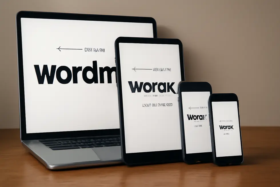
2. Leveraging Wordmarks for Cohesive Digital Branding and Media Presence
Wordmarks play a crucial role in digital branding, where clarity and adaptability are essential. Their text-focused design ensures legibility across platforms like website headers and social media profiles, maintaining brand consistency with strict guidelines on size, spacing, and color usage. Beyond digital screens, wordmarks translate effectively to packaging and merchandise, demanding clear rules for minimum size and color variations to uphold visibility and recognition. Advertising materials benefit from the simplicity of wordmarks, allowing typography and palette choices to express brand personality with ease. Detailed visual brand guidelines safeguard the integrity of wordmarks by specifying clear spaces, resizing constraints, and acceptable color formats while prohibiting distortions. Iconic examples demonstrate how wordmarks embody brand eras and stories, proving their versatility across physical and digital media. For deeper insights on protecting names and logos, explore trademark protection for business names and logos.
3. Mastering Brand Guidelines to Ensure Wordmark Consistency and Recognition
Brand guidelines are crucial for maintaining the integrity and recognition of a wordmark. These guidelines specify exact rules for wordmark usage, including minimum size, clear space around the text, and prohibitions against alterations like color shifts or distortions. Typography choices define the fonts, weights, and styles that reflect the brand’s personality, ensuring cohesion across all communications. The color palette—precisely outlined with HEX, RGB, or Pantone values—reinforces identity and accessibility. Additionally, brand guides provide templates for applying wordmarks on diverse materials, from digital ads to business cards, preserving visual harmony. Iconic wordmarks demonstrate how strict adherence to such guidelines fosters instant familiarity and trust. For businesses seeking to protect their textual brand elements, understanding these standards complements trademark efforts in securing exclusive usage rights. Learn more about trademark protection of business names and logos here.
For detailed frameworks on brand guideline development, the Moldstud article offers comprehensive insights and annotated examples: https://moldstud.com/articles/p-visual-brand-guidelines-your-ultimate-path-to-effective-brand-communication.
4. Seamless Brand Unity: Integrating Wordmarks into Packaging and Merchandise
Product packaging and merchandise serve as vital platforms for reinforcing a brand’s identity through wordmarks. By featuring a wordmark that embodies distinctive typography and color, brands create a unified visual presence across all consumer touchpoints. This approach enhances recognition and conveys brand personality directly through carefully crafted typographic choices. On packaging, the wordmark often becomes the focal point, guiding the overall design and ensuring legibility in varied sizes and contexts. Merchandise, including apparel, benefits from branded wordmarks printed strategically, such as inside neck labels or custom inserts, elevating perceived quality and engagement. Advanced design collaborations and AI-powered mockups streamline this integration, helping brands maintain consistency while adapting to different formats. This deliberate fusion of wordmark and product design fosters lasting brand loyalty and clear market positioning. For further insights on brand protection in these contexts, explore trademark protection for business names and logos. For notable real-world examples, detailed case studies of wordmark usage in packaging are available on Vistaprint.
5. Enhancing Brand Identity: Integrating Wordmarks with Visual Elements for Versatile Logos
Combining wordmarks with visual elements like symbols or icons creates versatile logos, enabling brands to adapt to diverse contexts. This integration balances clarity and symbolism, where the wordmark communicates the brand name clearly, and accompanying icons enhance instant recognition and emotional appeal. Such combination marks are common in various industries, allowing flexible usage—from full logos on packaging to concise symbols on small labels or digital icons. Careful alignment of typography, color, and scale ensures consistency and readability across media. By blending text with graphic elements, brands achieve a stronger visual identity that tells a richer story and supports flexible branding strategies. For more insight on protecting your brand name and logo, see trademark protection for business name and logo.
Additional practical examples and guidelines are detailed at Wix’s Brand Design 101.
Final thoughts
A wordmark distills your brand down to its essence through intentional typography, color, and clarity. For business owners, mastering the nuances of wordmark design offers the opportunity to establish a strong, recognizable identity that communicates directly with your audience. Every design element—from font selection to color choices and legibility optimization—reinforces your brand’s personality and message without distractions. Wordmarks prove that sometimes simplicity holds the greatest power in branding, making your name the symbol customers remember most. Understanding and applying these principles effectively ensures your brand stands out in a crowded marketplace, fostering trust and familiarity with every interaction.
Your IP is the foundation of your success – let’s protect it together before it’s too late. We can’t wait to help you turn your ideas into legally secured assets.
About us
undefined